Terracotta
The clinic in daylight.
- Status
- Live
- Year
- 2026
- Made with
- Next.js 16, Tailwind v4, Full build, Med spa
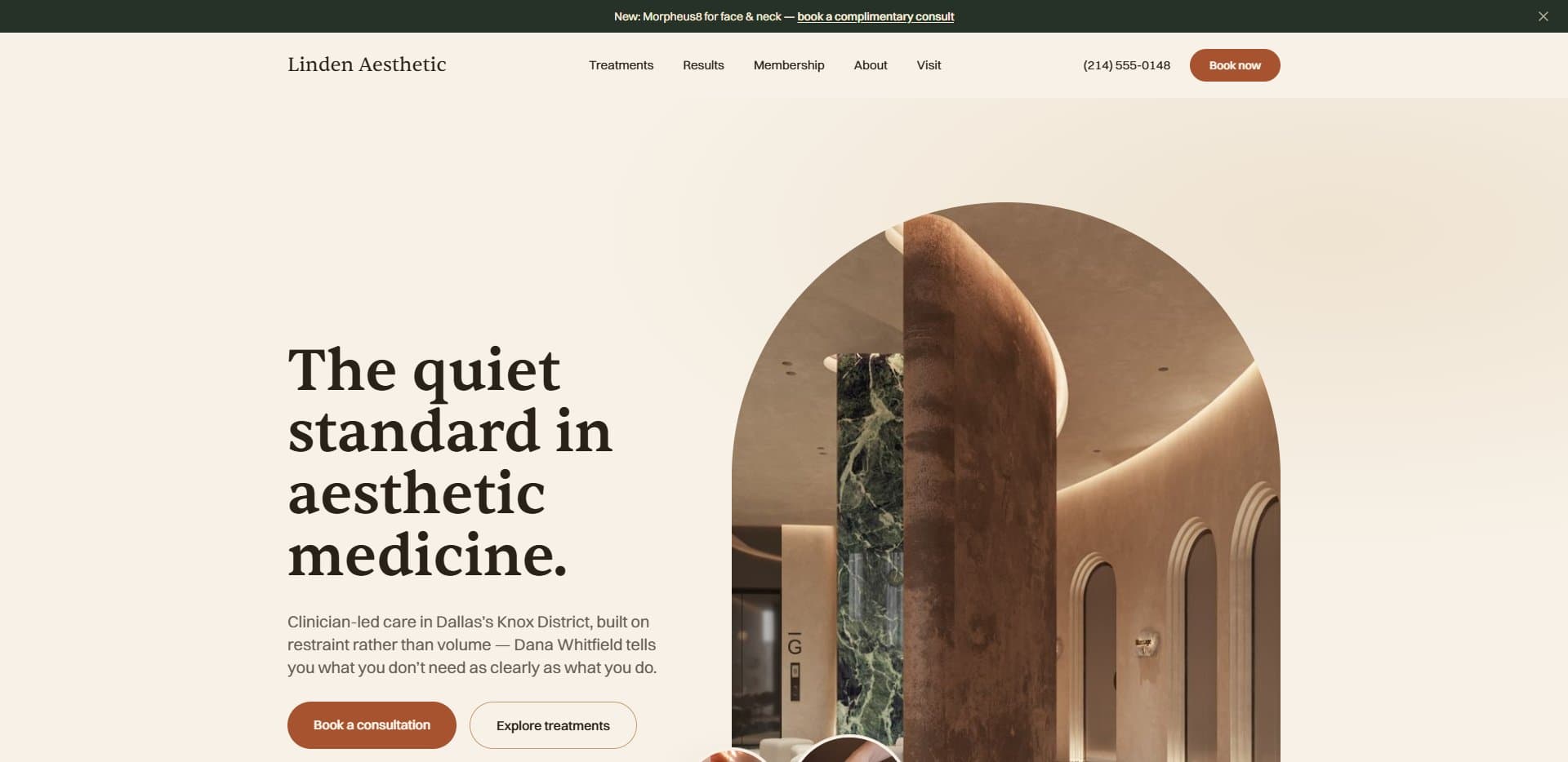 meteoricstudio-medspa-terracotta.netlify.app
I took a real med spa's website, stripped it back completely and rebuilt the whole thing under a new name. Every treatment, price and legal page is there, along with everything else a real business actually needs online.
Why it exists
I kept building pages. Heroes, landing pages, the fun part. What I'd never done was build the whole website a real business runs on, including all the boring pages that hold it up and that nobody ever screenshots. So I picked a category where that really matters. A med spa sells needles and lasers to people who are nervous about both. Its site has to answer every question before it's asked, price things honestly, stay on the right side of medical rules, and still feel like somewhere you'd want to walk into. I took two real clinic sites as a starting point, renamed them, and rebuilt both from nothing. This is the first: Linden Aesthetic Medicine, a Dallas clinic that doesn't exist, built as if it did.
Blueprint first
Before writing a single component, I wrote the whole thing down: an eleven section spec covering the sitemap, every page template, the legal documents, a performance budget, and rules for motion and images. It drew a line I still think about, between an execution mistake and a business decision. An ad that lands on the homepage instead of the treatment it advertised is a mistake, and you fix it with confidence. What the clinic charges for Botox isn't your call, so the site has to be built so the owner can make it. Most of what I learned sits somewhere near that line.
What a full build means
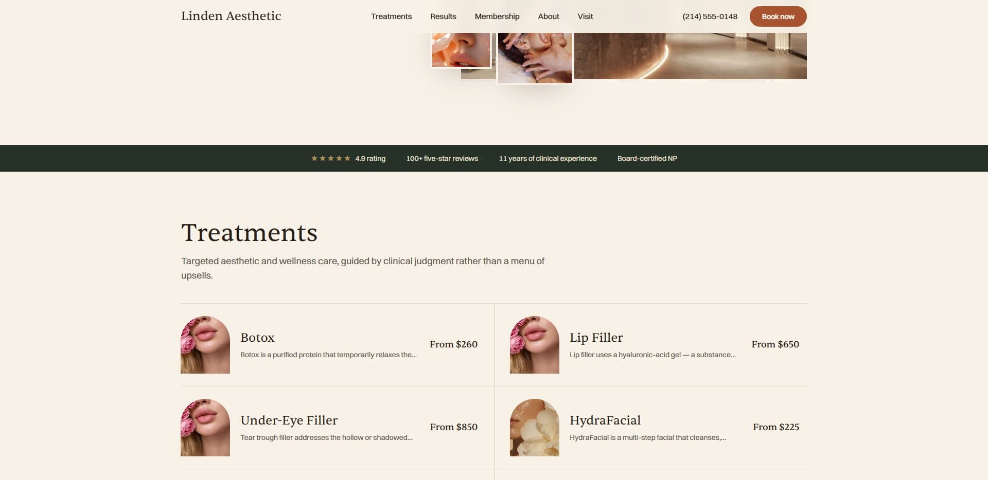
- Thirteen treatments
Botox through IV therapy, filed under Face, Skin, Body and Wellness. I chose that structure because it works at thirteen treatments and would still work at a hundred and twenty.
- A page for each one
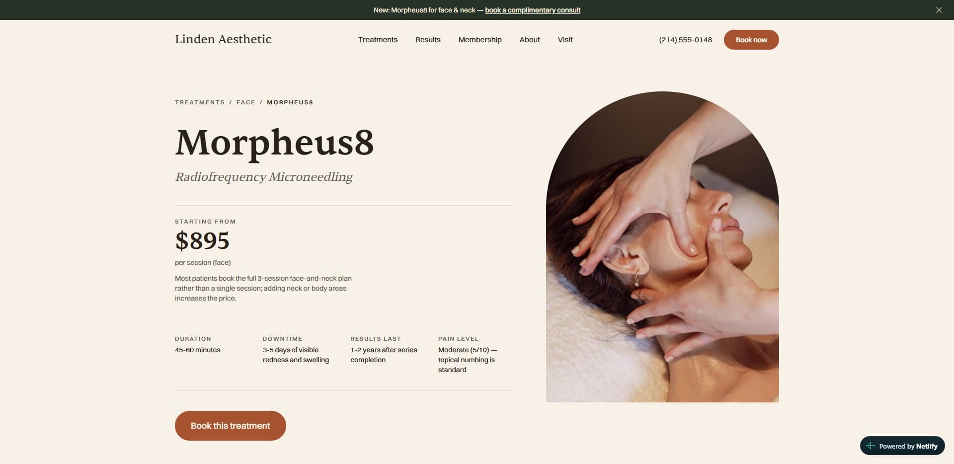
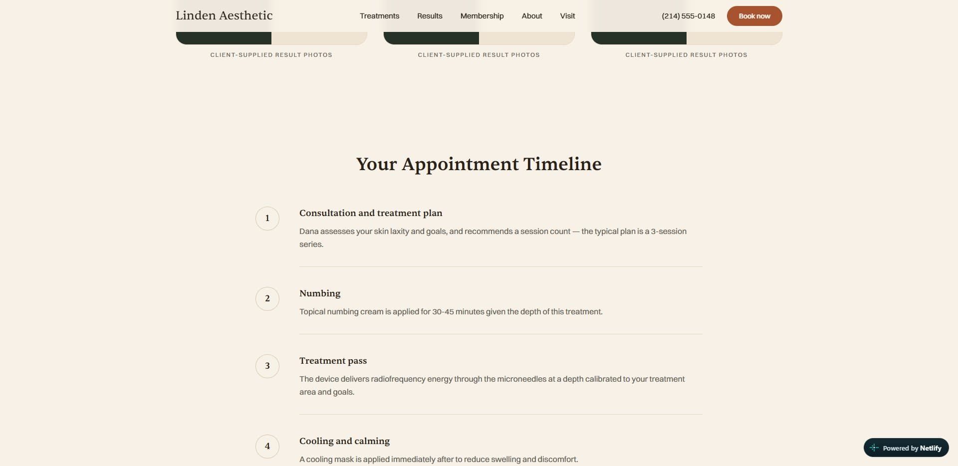
Price, session length, downtime, how long results last, an honest pain score, a timeline of the appointment, and a straight list of who it isn't for.
- Four ways to show a price
Exact, from, a range, or consult only. Every price lives in one content file and never gets typed into a page, so the whole menu can change how it shows prices in a single edit.
- Eight legal documents
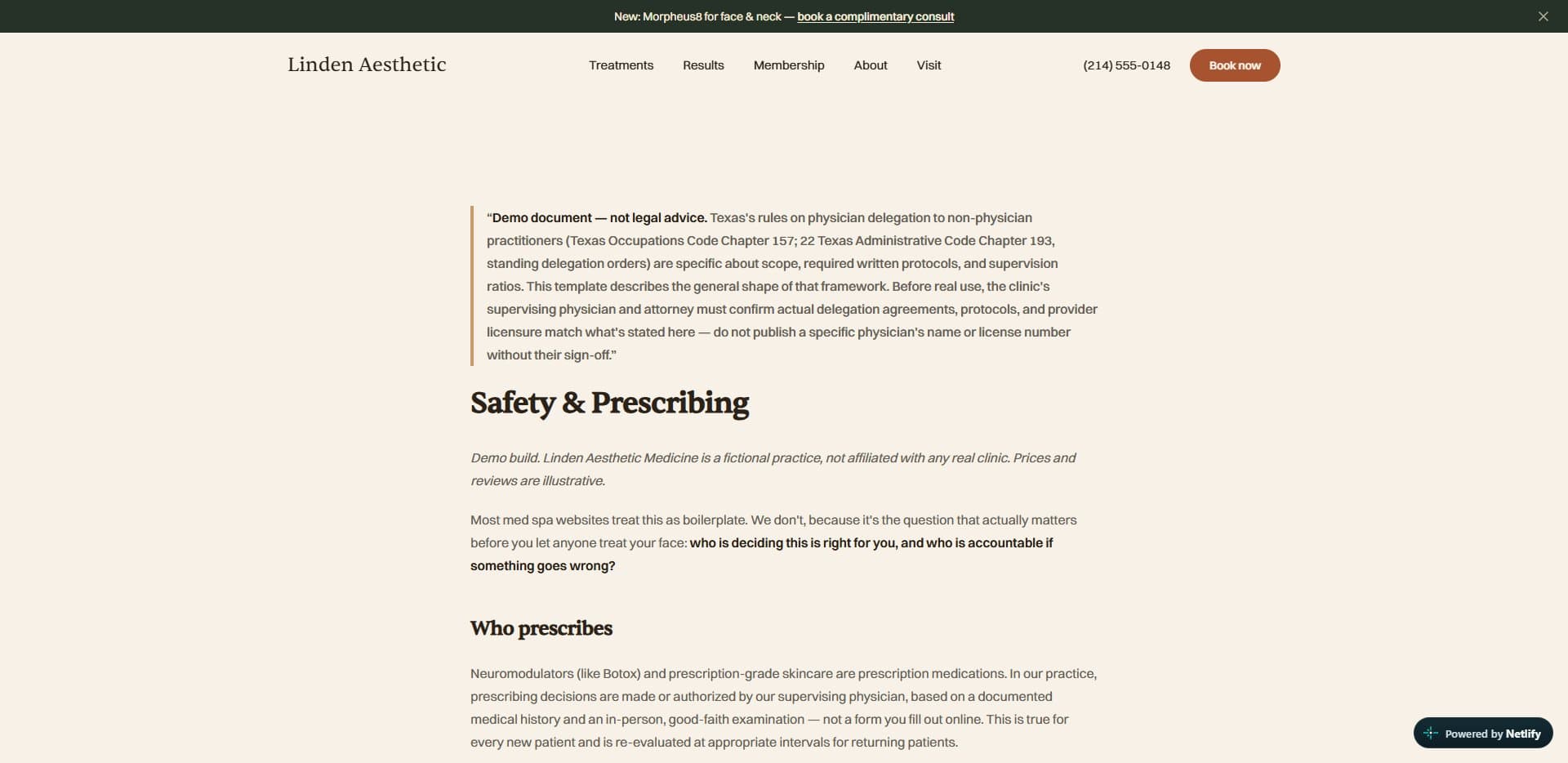
Privacy policy, a HIPAA notice of privacy practices, terms, cancellations and no shows, safety and prescribing, accessibility, SMS consent, and an internal photo consent form.
- Booking, one tap away
On a phone, a Call and Book bar slides up once you're a quarter of the way down the page and stays there. It's the most important feature on the whole site.
- The pages nobody sees
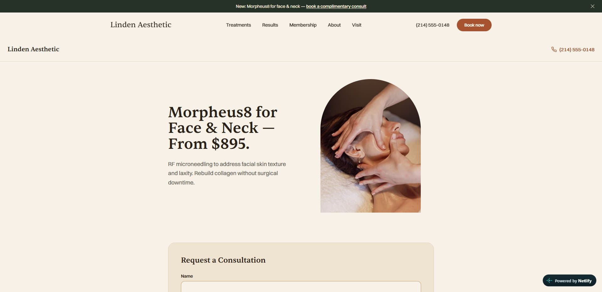
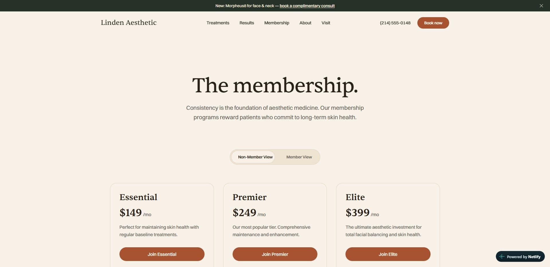
Membership tiers, financing, specials, a journal, the team, and an ad landing page for Morpheus8 with no navigation at all and a second and a half to load.
The look
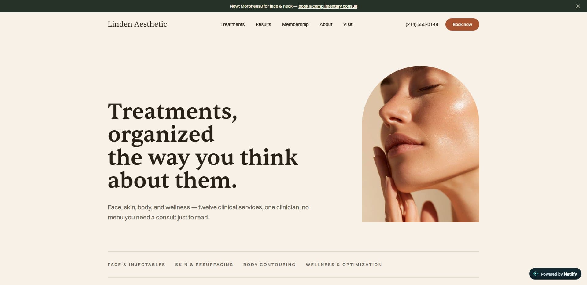
The first pass looked like every clinic template on the internet: clinical grey, stock smiles, nothing you'd remember an hour later. So I redesigned it as a place instead of a brochure. Terracotta plaster, green verde marble, brushed brass, and arches cut into the photography. Sentient for the headlines and Switzer for everything else, both self hosted so nothing waits on a font server. Warm cream where most clinics go cold and white. I wanted it to feel like the room you'd be sitting in, before you ever sat in it.
Inside Terracotta
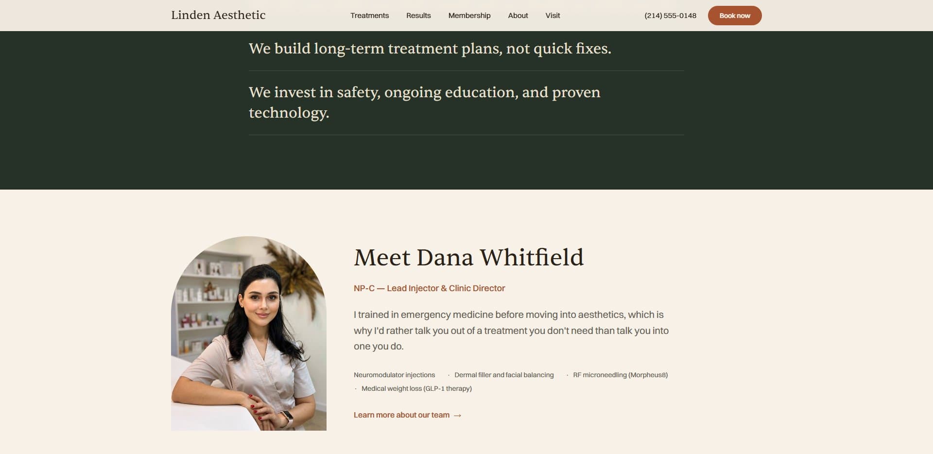
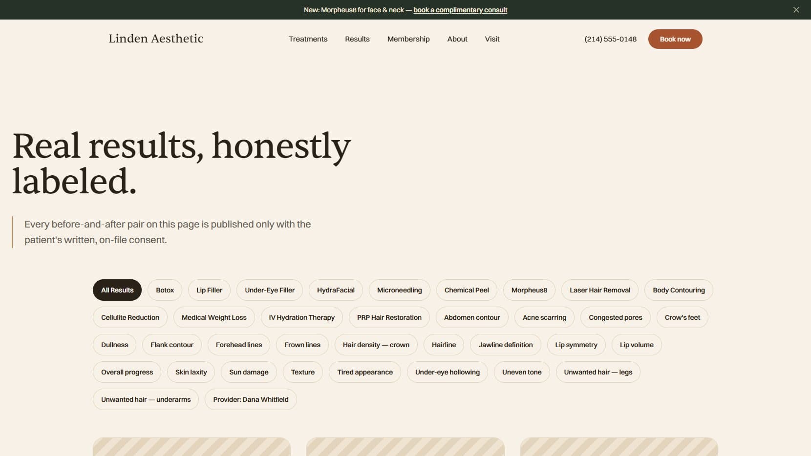
The menu, the clinician, a treatment page, the honest results page, the ad landing page, the legal layer
The honesty rules
Medical websites make it very easy to lie, so I wrote rules against it before writing any code. No fake before and after photos, ever, not even generated ones. Where real consented photos would go, the results page shows a clearly labelled empty frame and explains why it's empty. Motion got the same discipline. Only four things on the whole site are allowed to move: the hero as it loads, the before and after slider, the treatment filter and the booking bar. There's no parallax, no cards lifting on hover and no counters ticking up. In a clinic, stillness reads as competence, and it keeps the page fast.
The rest of the house
The space, the full menu, an appointment timeline, membership

Anyone can build the homepage. The business lives in the forty pages behind it.
Under the hood
- Stack
- Next.js 16 · React 19 · TypeScript
- Styling
- Tailwind v4 · custom tokens
- Type
- Sentient · Switzer, self hosted
- Content
- 13 treatments · 8 legal documents
- Budget
- under 2s to load · 1.5s on ad pages
- State
- Live · static export
Verdict
The homepage was the easy part. The real thinking went into everything under it: the legal pages, the pricing logic, the answers in every FAQ, and what a nervous person sees when they open it on a phone at midnight. I understand now why a proper clinic website costs what it does, and why so many of them still get it wrong.